Fixit
Fixit is a modern handyman booking platform that connects users with trusted, verified technicians for fast, reliable home and office services. From plumbing and electrical repairs to installations and maintenance, Fixit makes it easy to find skilled professionals, book instantly, and track jobs in real time — all from one simple app.
Fixit is a modern handyman booking platform that connects users with trusted, verified technicians for fast, reliable home and office services. From plumbing and electrical repairs to installations and maintenance, Fixit makes it easy to find skilled professionals, book instantly, and track jobs in real time — all from one simple app.
CLIENT
Fixit
YEAR
2025
SERVICE
Web App
ROLE
UIUX Design
A thoughtfully crafted service platform that prioritizes clarity, speed, and trust. This design demonstrates how clean UI, structured information, and responsive layouts can turn everyday services into a premium digital experience.
A thoughtfully crafted service platform that prioritizes clarity, speed, and trust. This design demonstrates how clean UI, structured information, and responsive layouts can turn everyday services into a premium digital experience.
A product-led design approach that aligns user needs with business goals. Every component is purposeful, supporting both ease of use for customers and operational efficiency for service providers.
A product-led design approach that aligns user needs with business goals. Every component is purposeful, supporting both ease of use for customers and operational efficiency for service providers.

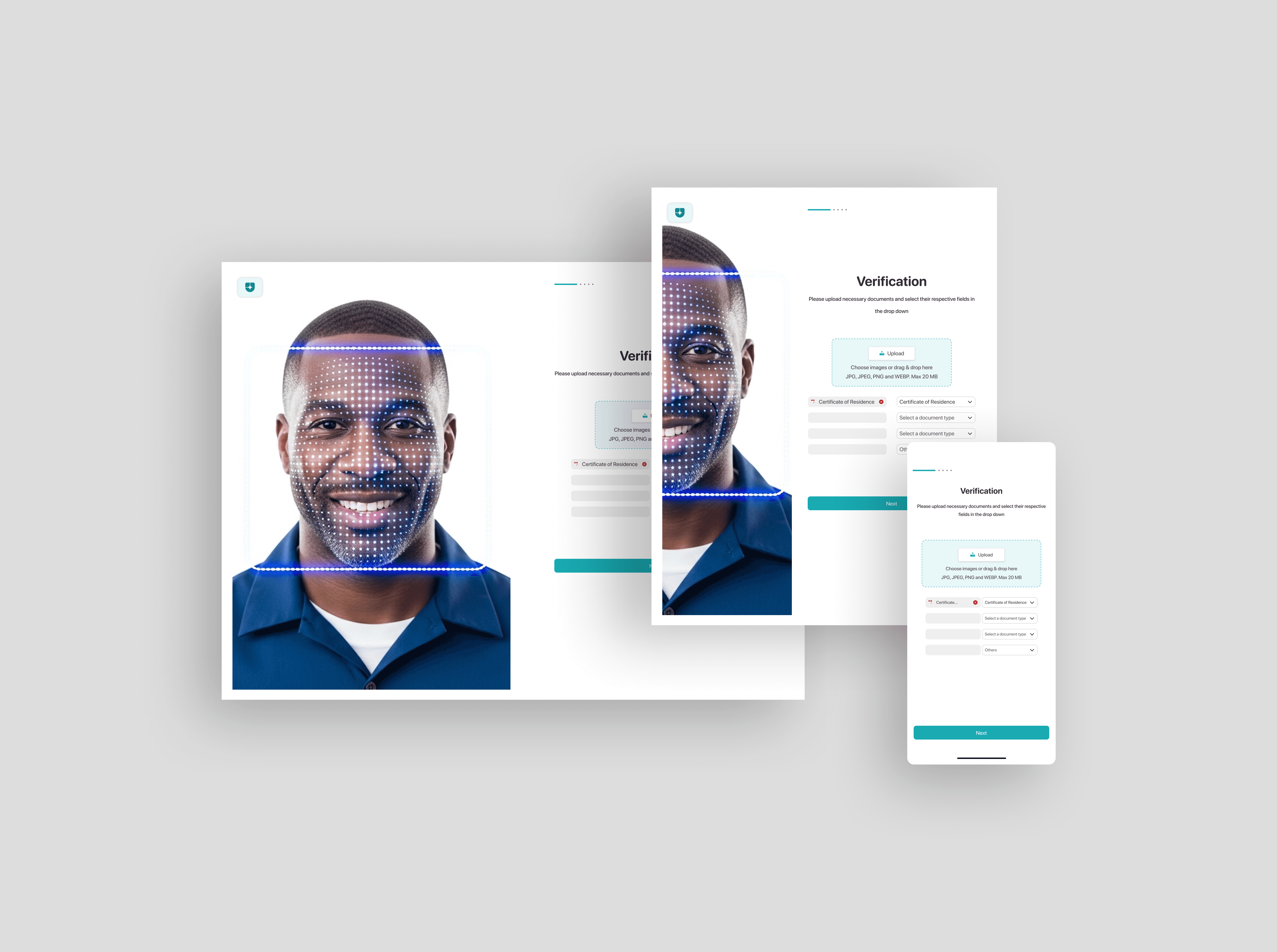
No-Code & Development Ready
No-code-ready design system engineered for speed and consistency. Modular components and clear structure allow designs to translate effortlessly into production using modern frameworks.
No-code-ready design system engineered for speed and consistency. Modular components and clear structure allow designs to translate effortlessly into production using modern frameworks.
Design system designed to turn ideas into production-ready experiences faster. By aligning design with development from day one, businesses gain speed to market, visual consistency, and a foundation that scales as the product grows.
Design system designed to turn ideas into production-ready experiences faster. By aligning design with development from day one, businesses gain speed to market, visual consistency, and a foundation that scales as the product grows.
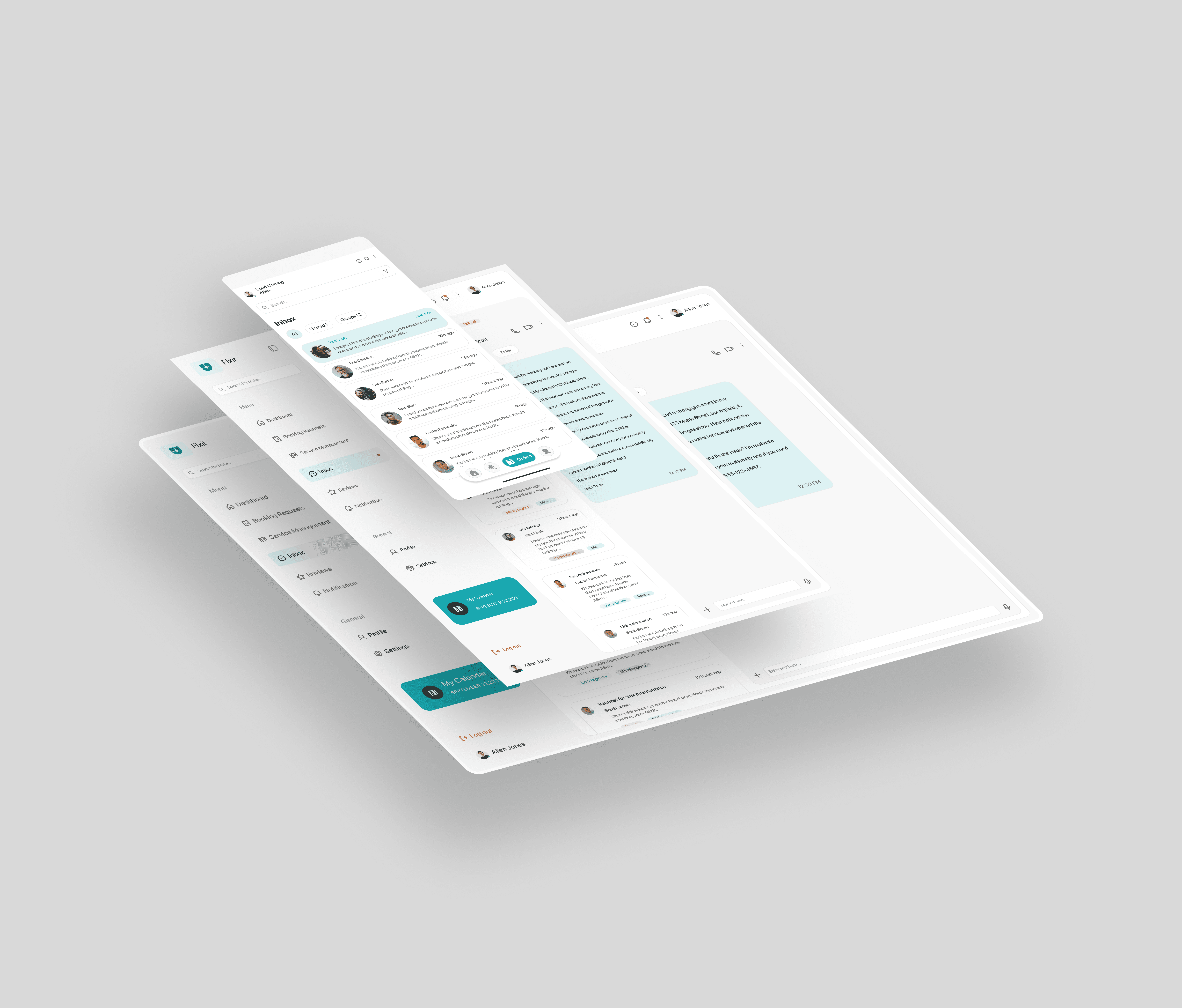
Responsive Across all Devices
Through a device-agnostic design process, interfaces are tested and refined across multiple breakpoints before development begins. This ensures smoother handoff, faster implementation, and a final product that feels intentional on every screen.
Through a device-agnostic design process, interfaces are tested and refined across multiple breakpoints before development begins. This ensures smoother handoff, faster implementation, and a final product that feels intentional on every screen.
Transform your vision into a stunning, high-converting website with our expert design process—tailored, user-focused, and results-driven. Attract more clients effortlessly. Let's build your online success today!
Transform your vision into a stunning, high-converting website with our expert design process—tailored, user-focused, and results-driven. Attract more clients effortlessly. Let's build your online success today!
Responsiveness is built into the design process from day one. Screens are structured with flexible grids, adaptive components, and scalable typography that respond intelligently to different screen sizes. This approach allows the design to be tailored effortlessly to desktop, tablet, and mobile without compromising usability or visual integrity.
Responsiveness is built into the design process from day one. Screens are structured with flexible grids, adaptive components, and scalable typography that respond intelligently to different screen sizes. This approach allows the design to be tailored effortlessly to desktop, tablet, and mobile without compromising usability or visual integrity.
WORKS